

In case you missed it, here’s the link to Part 1 of this series. This week, we move onward, highlighting another set of ten wonderful pieces of album art.
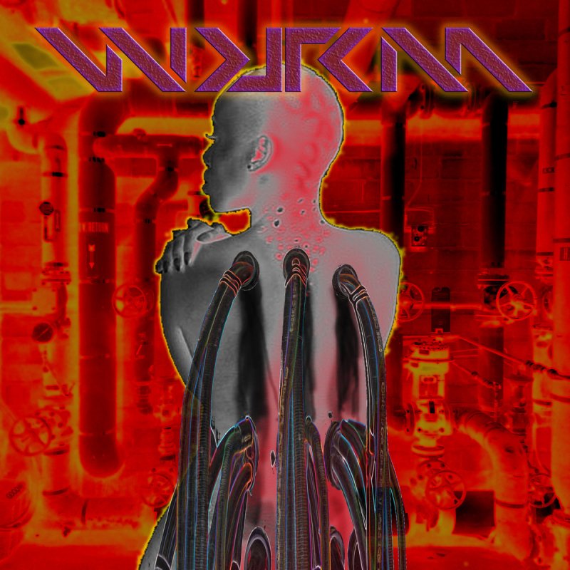
To start off, here’s the cover of BioMechanical by WURM. There’s nothing subtle about this high-saturation, high-contrast image. Combined with the sci-fi looking font (which I adore), this art creates a firm atmosphere, preparing you for WURM’s experimental electronic sound.
Next up is the album Ragnarok by Even Death May Die. I really love how it looks halfway between art and a photograph here. The two blend together seamlessly. The black-and-white works well, keeping it crisp and clean yet unmistakably dark. I love how “Even Death May Die” is written- beautiful font!

This is the track cover of the Stave Church’s for Langston. The visual artist behind the piece, Ryan Thomas Mitchell, says “I designed the cover with one directive: include imagery of The Stave Church that inspired the project’s name. Their previous covers also featured the church, so I wanted to do something that stood out and “popped” in comparison. I also wanted to represent the inside of the church, and what it might feel like to stand in the center, look up, and feel the grandness of the whole thing.”
I love the overall composition here. I’d definitely buy this as a poster to hang on my wall. There’s a whole lot going on, and yet, it doesn’t feel over-busy or over-burdened.

Let’s do a complete 180 away from black-and-white and look at some color. Lots of color! Here’s the art for The New Flesh by Helvete Inc., done by Hemlock Wargrave. I love this piece in how overwhelming it is- in a good way! Listen to the first track off the album, and you’ll immediately see how this art is a good fit. The music is industrial and aggressive, a coordinated bombardment of instruments and voices. The album art perfectly encapsulates that in visual form. It’s a match made in heaven- or hell, perhaps!

You like color? Good news, because here’s some more color! Blacklight by Blindcopy, with art done by Whitney Flaherty. Does this remind you of a rave? With (literal) blacklight and neon colors all around? The comparison might be fitting- the track, “Blacklight,” is certainly an upbeat, danceable one. And how pretty this image is to look at!

Okay, enough color for now. Here’s the monochromatic cover of of Real Bad Day by amnestic, done by Sam Pfannkuche (aka Sam Pancake). According to Sarah Elizabeth, “Photo is from when we were stuck in London Heathrow airport for (what turned out to be) about 16 hours before our flight was rescheduled for the next day. We picked this photo because of the emptiness and loneliness it conveys – both themes within the album itself.” She’s right about that- the photo is strikingly devoid of human life.
I would also enjoy this art on a poster. The angles inherent to the photography are wonderful, and the addition of the words within the photo is both creative and masterful. This is exceptional.

It’s hard to pick just one Star Noir album cover to review, but I’ve settled on Society. According to Jody Coombes, “This piece was done 3 years ago and was my first album and the first real bit of album art I ever did. It was based on a photo I took in Hong Kong while I was over there. The concept of the cover was based on the idea of the state of society today and my views on some of the current problems we face. The hand coming into the scene (which is a photo of my own hand) was supposed to represent how I would like to change things if I had the power to make things better.”
I love the sort of faded, dream-like pink washed over it all. It matches the somewhat melancholy feel of the music. I’d call this art cyberpunk, maybe. It’s beautiful. You can really just sink into this piece.

Now onto James Chapple’s project, Kiss is Kill, and album Imposter Syndrome. The art for it was done by Pete Crossman (of Victory Pill). Though not exclusive to this album, I love the logo for Kiss is Kill. It looks almost…military? According to Chapple, “it looks like play/pause/rewind icons all lined up,” which I can also see.
“My favorite little detail,” Chapple says, “is that he incorporated the sawmill from Twin Peaks in the buildings across the bottom (its the large smoke stack on the right). When he was here visiting from England, we actually visited Twin Peaks, so this was a nice little personal detail.”
The music is Industrial in genre, which is mirrored in the literally industrial set of buildings lining the bottom third of the piece. I also get the industrial vibe from what looks like cracked concrete as the background texture. Everything looks balanced and well-composed.

To change genres a bit, here’s the cover to the All-Nite Starlite Electronic Café by Glass Apple Bonzai, a synthwave band. This piece was made by SIZER Design + Illustration. I really like the attention to detail here- the various sized stars, the textures on each planet, the distinct personalities of each alien cafe-goer…very nice. Aesthetically, I like the blend of retro (the cafe/diner style, the neon, etc.) with futuristic (space). This mirrors the music itself, blending 80s-esque synthpop with a modern touch.

To end this article, here’s the album art for Black Synthetic and Dense by CIRQUE D’ESS. According to Ryo Nubeat, this art “comes out from a frame of the 1st video I made for the song “Hole-Frog”. The woman is Miriam, in that particular moment she was immersed in a massive projection of images all over the body, just like body painting but using a projector.” This is a unique (or, at the least, rare) technique, and I like that. This piece is understated, calm, with lots of negative space. It says what it needs to say, in just as much space as it needs. It is dark and beautiful.
